Getting the most out of stock LaTeX
Y’all know it: TeX and LaTeX are godsends brought to you by two CS icons and an innumerable amount of kind people. But, you may be tired of the bland default look from which you can tell immediately, that a document is made with TeX. With a careful selection of packages and settings you can still a decent look with a stock LaTeX distribution:
Before I’ll go into detail, a word of warning first: aesthetics is a subjective matter and I have my own taste regarding text. You might not agree with this but you still could get an idea what to change to achieve a certain look.
The preamble
First let’s have a look how I created the initial document:
\documentclass[a4paper,english]{scrartcl}
\usepackage[english]{babel}
\usepackage{hyperref}
\begin{document}
\selectlanguage{english}
\section{What is a Blog}
A blog (a portmanteau of the term \emph{web log}) is a discussion or
informational site published on the
\href{http://en.wikipedia.org/wiki/World_Wide_Web}{World Wide Web} and
consisting of discrete entries (``posts'') typically displayed in reverse
chronological order (the most recent post appears first). Until 2009 blogs
were usually the work of a single individual, occasionally of a small group,
and often were themed on a single subject. More recently MABs have
developed, with posts written by large numbers of authors and professionally
edited. MABs from newspapers, other media outlets, universities, think
tanks, interest groups and similar institutions account for an increasing
quantity of blog traffic. The rise of
\href{http://en.wikipedia.org/wiki/Twitter}{Twitter} and other
``\href{http://en.wikipedia.org/wiki/Microblogging}{microblogging}'' systems
helps integrate MAB and single-author blogs into societal newstreams.
\emph{Blog} can also be used as a verb, meaning to \emph{maintain} or
\emph{add content} to a blog.
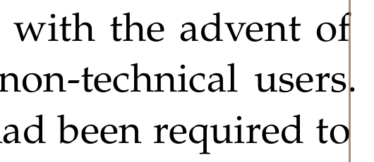
The emergence and growth of blogs in the late 1990s coincided with the
advent of \href{http://en.wikipedia.org/wiki/Blog_software}{web publishing
tools} that facilitated the posting of content by non-technical users.
(Previously, a knowledge of such technologies as
\href{http://en.wikipedia.org/wiki/HTML}{HTML} and
\href{http://en.wikipedia.org/wiki/FTP}{FTP} had been required to publish
content on the Web.)
\end{document}
Instead of the standard article document class, I typeset the Wikipedia
article with the drop-in replacement from the KOMA script package. This
package provides a better overall geometry – especially compared to other
German documents – and a lot of customization opportunities. I also added the
hyperref package to typeset URLs. Everything looks okay so far, but not very
nice either.
Fonts
The most apparent difference between both documents is the font. Although the
default Computer Modern font was designed with the best intents, it was
developed by Knuth for then-common laser printers. As you can see in
this comparison, it used to be a
good match on those printers but printed on a current laser printer it appears a
bit too skinny. To compensate for that, I typeset the body text with the
Palatino font. The font is available with all TeX distributions in the
mathpazo package and can be used with:
\usepackage{mathpazo}
\linespread{1.05}
The increased line spacing (or leading to be typographically correct) helps to improve the overall readability of the text.
By default, KOMA script already enables a sans serif font for all headlines, so they are still typeset in a bold version of Computer Modern. Unfortunately, this type face looks a tad too disproportionate. To fix this, I switched to the condensed bold version of Computer Modern with:
\setkomafont{disposition}{\fontseries{sbc}\sffamily}
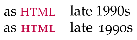
Your mileage may vary but I like old-style figures and real small caps, so that
figures and upper-cased words don’t stick out like sore thumbs. Both features
can be activated with the osf and sc options of the mathpazo package.
Also, the links are a little bit too obtrusive. To remove the boxes and color the actual link text with a mellow purple, I use:
\usepackage{xcolor}
\usepackage[colorlinks, urlcolor=purple]{hyperref}
The microtype package
You may wonder why we don’t just use XeTeX to setup the fonts. The long answer:
our premise is standard LaTeX. The real answer: the microtype package. This
package provides microtypographic features such as character protrusion,
tracking and more to even out the overall greyness distribution of the text. The
most obvious benefits are less hyphenation and a reduced amount of overfull
hboxes. To enable microtype support just add the microtype package to the
preamble of your document and enjoy characters such as periods that now protrude
to give the impression of a more even margin:
Indentation vs vertical space
There are two common ways to separate two paragraphs. First we can indent the first line of the succeeding paragraph by one en to one em of horizontal space. This is the prevailing style in novels and other fictional literature as well as the default style of LaTeX. But we could also separate both paragraphs with a vertical space resulting in the block paragraph style. The decision which style to use is entirely subjective, but I tend to use block paragraphs for technical documents.
To change to block paragraphs, append the parskip option to the scrartcl
class:
\documentclass[a4paper,english,parskip=half]{scrartcl}
Again, it really depends on the subject, choice of font and paper geometry whether to use a half empty line or a full one.
Acronyms with small caps
There are a lot of acronyms in the example text for which I use the acronym package. This package helps you to manage the acronyms and print a summarizing list. Just put
\usepackage[nolist,nohyperlinks]{acronym}
into your preamble and add new acronyms with the acronym environment:
\begin{acronym}
  \acro{mab}{multi-author blog}
  \acro{html}{Hypertext Markup Language}
  \acro{mab}{File Transfer Protocol}
\end{acronym}
You can insert an acronym with \ac{acronym} which will print the long form the
first time the macro is used, and the short form on each subsequent call. You
can always use the short form with \acs{} and typeset plural forms with
\acp{}. Now, by default the acronyms are not typeset in any special way but as
you can see I like to have them in small caps. For this we just have to redefine
the \acsfont macro:
\renewcommand*{\acsfont}[1]{\textsc{#1}}
That’s it so far and I can only encourage you to have a look at the vast amount of packages that enhance your documents tremendously. Just to name the few that I use regularly: booktabs, TikZ, pgfplots.