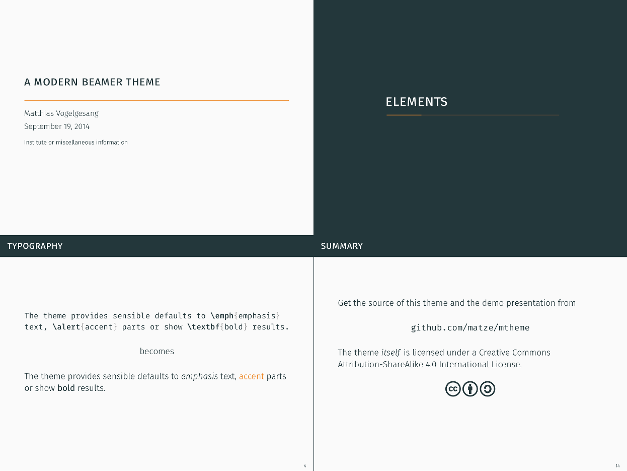
A modern Beamer theme
Beamer is an awesome way to make slides with LaTeX. But I always felt that the stock themes do not necessarily look particularly nice and the custom themes often scream “Beamer” at first sight.
So, I sat down and made the mtheme …

In the spirit of Jan Tschichold and Matthew Butterick, the theme tries to minimize visual noise and maximize space for content. Thus an ordinary slide is free of superfluous elements such as a navigation bar, progress indicators and heavy block elements. What’s left is all the necessary information: the frame titles, a frame number to refer to the slide and the actual content.
Colors
Yes, teal and
orange
is an annoying fad in movie productions but it is a refreshing choice for a
presentation theme. Rather than using both colors all the time, a dark teal tone
is used for the majority of the Beamer elements while orange is used to
highlight bits and pieces such as \alert{} commands. Instead of going for an
all-white background, I toned it down a tiny notch to reduce eye strain but keep
the contrast high enough to easily discern individual letters.
Fonts
Fira Sans
is gorgeous typeface commissioned by Mozilla and designed by
Carrois. It comes with an enormous amount of
styles and features that cover even the most adventurous presentations. In the
mtheme I used Fira Sans Light as the main font and the regular Fira Sans
Book typeface for any heavier uses such as \textbf{}. Fira Sans Mono is a
perfect match for lstlistings or minted environments.
Titles tend to be difficult to get right because of capitalization which almost always looks weird. I avoid this problem by lowercasing frame titles and set them in small capitals of Fira Sans Book.
Sections
In a presentation it can sometimes be difficult to go from one sub-topic to another. An elegant solution is to insert a slide whenever a new section starts. As a little gimmick, the mtheme features a tiny progress bar drawn with TikZ below the section title.
Chart styles
A visual representation of numerical data can help to draw conclusions about an issue quicker than large columns of numbers. Nevertheless, to achieve this honorable goal, this representation must focus on the data and avoid any redundant or unnecessary information by increasing the data-ink ratio, a term coined by Edward Tufte.
I like to use the pgfplots package to
visualize two- and three-dimensional data sets but the default style is –
although better than what Excel offers – not very impressive. To improve the
look, I include the (horizontal) mbarplot and mlineplot styles which reduce
the number of visual elements such as boxes and employ a color scheme that is
(hopefully) easier on the eyes.
Conclusion
Even though this theme might give your presentation a somewhat “professional” look, you should focus on content first. Because the comments are not back yet, you can leave any feedback in this reddit thread.